

How to read a flame graph
How to read CPU, allocation, lock and wall-clock flame graphs from a Java profiler, how trace flame graphs differ, and the shapes that point straight at the problem.
On this page
- Picture it first: from stack samples to a flame graph
- A worked example: the slow pricing endpoint
- Four kinds of profile, one picture
- Generating flame graphs in Java
- Trace flame graphs: when the x-axis is time
- Patterns to recognise on sight
- Advanced: how people misread flame graphs
- How to say it in the interview
🔥 What is a flame graph?
A flame graph is a picture of where time goes, built from thousands of stack samples. Each box is a function, boxes stack on top of the functions that called them, and a box's width is the share of samples it appeared in. If Pattern.compile is 44% wide in a CPU flame graph, 44% of your CPU samples were inside it, and you've probably found your problem in under a minute.
Brendan Gregg invented flame graphs in 2011 while chasing a MySQL performance issue: he had thousands of lines of profiler output and needed to see them all at once. The idea spread to every profiler that matters, and the same visual language now appears in distributed tracing. For this lesson, we'll learn to read both kinds: profiling flame graphs from a Java profiler, and trace flame graphs from OpenTelemetry spans. Interviewers ask about this because "the service is slow, what do you do?" is half of every senior interview, and a candidate who can read a flame graph out loud sounds like someone who has actually fixed production.
Below the line (out of scope)
- Every option of async-profiler (see async-profiler in practice (later in this module))
- Recording configuration and the JMC UI (see Java Flight Recorder and Mission Control (later in this module))
- Instrumenting services with OpenTelemetry SDKs
- How profilers walk native stacks
The 30-second answer
A profiling flame graph merges sampled call stacks: the y-axis is stack depth, and width is the share of samples, so wide means expensive. The x-axis is sorted alphabetically, not by time. I look for the widest plateaus, the top edges with nothing above them, because that's self time where CPU is actually burned, then search and zoom to confirm. I pick the profile type for the question: CPU for hot code, wall-clock for waiting, allocation for GC pressure, lock for contention. Trace flame graphs look similar, but there the x-axis is time, so gaps and staircases of sequential spans are real latency.
What you’ll learn
- What the x-axis, y-axis and width of a profiling flame graph mean, and why the x-axis is not time
- How to find hot code using plateaus, self time vs total time, search and zoom
- When to use CPU, wall-clock, allocation and lock profiles, and how to capture them with
asprofand JFR - How trace flame graphs work, where the x-axis is time, and how to spot an N+1 staircase
- A repeatable answer to "You see a CPU spike, walk me through it"
01Picture it first: from stack samples to a flame graph
Imagine photographing a busy kitchen every 10 ms and noting who's doing what: "head chef → plating → garnishing". After a minute you have 6,000 photos. Stack them by activity and the one that shows up in 40% of the photos is where the kitchen's time goes. You never timed anyone; you counted.
A sampling profiler does exactly that. At a fixed interval (async-profiler defaults to 10 ms of CPU time for CPU profiling; many Linux setups use 99 Hz so sampling doesn't fall into lockstep with timers), it interrupts running threads and records each call stack. Identical stacks are merged, and the result is drawn as one picture.
Four stack samples are merged into a flame graph where width is the share of samples and the top edge of each tower is self time
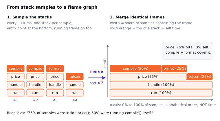
Here's how to read every part of it:
- y-axis: stack depth. The entry point (
Thread.run) is at the bottom; each frame sits on its caller. The top frame of any tower is the function that was on CPU when the sample was taken. - x-axis: share of samples, not time. Frames on the same level are sorted alphabetically so identical frames merge into one wide box. Left to right means nothing chronological.
- Width: inclusive (total) time. A frame's width counts samples in that function plus everything it called.
- Plateau: self time. The part of a frame's top edge with nothing above it is where that function itself was executing. That's what you optimise.
- Orientation. Some tools draw it upside down (an icicle graph, root at the top). Same data, same rules.
- Colour. In Gregg's original, warm colours are random and carry no meaning. async-profiler colours by frame type: green for JIT-compiled Java, aqua for inlined frames, yellow for JVM C++ code, orange for the kernel and red for native libraries. Don't read heat into colour.
02A worked example: the slow pricing endpoint
Try it yourself first
Before reading on, look at the code below and guess which line will dominate a CPU profile under load. Then compare with the flame graph.
POST /orders/price takes 2.1 ms of CPU per request and the service saturates its 8 cores at about 3,500 requests per second. Here's the code path:
import java.util.List;
import java.util.regex.Pattern;

record Line(String sku, long unitCents, int qty) {}
record Order(String id, List<Line> lines) {}

interface TaxTable {
    long lookup(String sku, long cents);
}

final class DiscountRules {
    static boolean matches(String sku, String rule) {
        return Pattern.compile(rule).matcher(sku).matches();   // parses the regex every call
    }
}

final class OrderService {
    private static final String PROMO_RULE = "^PROMO-[A-Z]{3}-\\d{4}$";
    private final TaxTable taxes;

    OrderService(TaxTable taxes) {
        this.taxes = taxes;
    }

    long price(Order order) {
        long total = 0;
        for (Line line : order.lines()) {
            long cents = line.unitCents() * line.qty();
            if (DiscountRules.matches(line.sku(), PROMO_RULE)) {
                cents = cents * 90 / 100;
            }
            total += cents + taxes.lookup(line.sku(), cents);
        }
        return total;
    }
}

final class JsonWriter {
    static String write(Order order, long totalCents) {
        return String.format("{\"id\":\"%s\",\"totalCents\":%d}", order.id(), totalCents);
    }
}
We capture 30 seconds of CPU samples under production-like load and get this:
Before the fix, a CPU flame graph shows Pattern.compile and its internals taking 44% of all samples
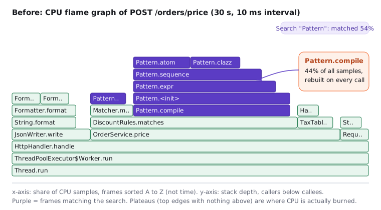
This is the path I take with any flame graph, in this order:
- Scan the top edges for the widest plateaus. The widest flat tops here are
Pattern.atomandPattern.clazz, sitting on a tall purple tower. Narrow plateaus scattered everywhere mean "no single hot spot"; one or two wide ones mean an easy win. - Walk down from the plateau until the name means something to you.
Pattern.sequence,Pattern.expr,Pattern.<init>are JDK internals. Keep going down:Pattern.compile, called fromDiscountRules.matches. That's our code, and it's the frame you can change. - Search to total it up. Typing
Patterninto the search box highlights every match and reports 54% of samples: 44% compiling and 10% matching. Search is how you add up a function that appears in several places. - Zoom to check self vs total. Clicking
OrderService.pricezooms to that subtree. It's 70% wide but has almost no plateau of its own (about 2% self). Optimising the loop arithmetic would do nothing; the cost is in what it calls.
Notice what we did not do: we never read the graph left to right as a timeline, and we never started from the widest frame at the bottom (Thread.run is 100% wide and tells you nothing).
The fix is one line of intent. Pattern is immutable and thread-safe, so compile it once and create a cheap Matcher per call:
final class DiscountRules {
    private static final Pattern PROMO = Pattern.compile("^PROMO-[A-Z]{3}-\\d{4}$");

    static boolean isPromo(String sku) {
        return PROMO.matcher(sku).matches();
    }
}
The same trap hides in String.matches, String.split with multi-character regexes and String.replaceAll, which all compile a pattern per call. Same load, same 30 seconds, new profile:
After compiling the Pattern once, the regex tower is gone and String.format becomes the widest remaining frame
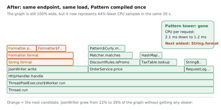
Here's the catch with "after" graphs: a flame graph is always 100% wide, so every surviving frame looks bigger. JsonWriter.write went from 22% to 39% without getting any slower; the total shrank around it. Confirm the win with an absolute number (CPU per request dropped from 2.1 ms to 1.2 ms, and the same 8 cores now serve about 6,000 requests per second), then pick the next target. Here it's String.format, which parses its format string on every call.
03Four kinds of profile, one picture
The flame graph is only the drawing. What the width counts depends on what you sampled, and picking the wrong kind is the most common reason a profile "shows nothing".
| Profile | Width counts | Answers | async-profiler |
|---|---|---|---|
| CPU (on-CPU) | samples while threads run on a core | "What burns CPU?" | -e cpu |
| Wall-clock | samples of all threads, running or not | "Where does a request spend its time, including waiting?" | -e wall |
| Allocation | bytes allocated (sampled at TLAB boundaries) | "Who creates the garbage that drives GC?" | -e alloc |
| Lock | time spent waiting to acquire contended locks | "Where do threads queue on synchronized or ReentrantLock?" |
-e lock |
A request that takes 800 ms but uses 5 ms of CPU will be invisible in a CPU profile. That's an off-CPU problem (I/O, a pool, a lock), so reach for wall-clock or lock profiling. Allocation flame graphs pair with the GC signals from Java memory management: a high allocation rate there becomes a wide alloc tower here.
Differential flame graphs compare two profiles, say before and after a deploy. The shape comes from the second profile, and colour shows the change: red frames grew, blue frames shrank, and the saturation shows how much. They're the fastest way to answer "what got slower in this release?"
Here's a story that plays out in many teams. A checkout service's p99 doubles after a release while CPU stays flat at 30%. The CPU flame graph looks the same as before, so everyone blames the database. A 30-second wall-clock profile split per thread (-e wall -t) shows request threads spending 60% of their samples parked in Logger.callAppenders: a new synchronous file appender behind a synchronized block. A lock profile confirms it, and switching to an asynchronous appender brings p99 back. CPU profiles only show threads that are running; the waiting is where the latency was.
04Generating flame graphs in Java
You have two vendor-neutral, low-overhead options, and both are safe to run in production for short captures.
# async-profiler 3.x: attach to a running JVM, 30 s, write an interactive HTML flame graph
asprof -d 30 -e cpu   -f cpu.html   <pid>
asprof -d 30 -e wall  -t -f wall.html <pid>   # -t: one tower per thread
asprof -d 30 -e alloc -f alloc.html <pid>
asprof -d 30 -e lock  -f lock.html  <pid>

# JFR: built into the JDK, records CPU samples, allocation, locks, GC and more
jcmd <pid> JFR.start duration=60s settings=profile filename=rec.jfr
jfr view hot-methods rec.jfr                      # Java 21+: quick text summary
jfr print --events jdk.ExecutionSample rec.jfr | head -40
jfrconv rec.jfr cpu.html                          # async-profiler's JFR-to-flame-graph converter
Open rec.jfr in JDK Mission Control for its flame graph view, or keep a continuous low-overhead recording running and jcmd <pid> JFR.dump it when something goes wrong. VisualVM can also sample, but for flame graphs on production systems I start with async-profiler or JFR.
Why those two? Because of safepoint bias. Older Java profilers asked the JVM for all thread stacks through JVMTI, and the JVM can only hand those over at a safepoint: a point where compiled code polls to see if it should stop. Hot loops may have no polls inside them, so every sample gets attributed to the next poll, often in the wrong method. Your profiler then confidently blames innocent code. async-profiler avoids this by interrupting threads with OS signals (via perf_events or timers) and walking the stack wherever the thread happens to be, using AsyncGetCallTrace and its own stack walker. JFR uses its own sampler that suspends threads and walks stacks outside safepoints. Both see the hot loop where it really is.
At the default 10 ms interval, async-profiler's CPU mode typically costs around 1 to 2% of CPU. JFR's default settings target under 1% overhead and the profile settings around 2%. Sampling cost scales with the interval, not with how fast your code is, so a 1 ms interval costs roughly ten times more.
05Trace flame graphs: when the x-axis is time
Distributed tracing borrows the shape but changes the meaning. A trace is the tree of spans for one request: each span has a name, a start and end timestamp, a parent span id, attributes and a status. Most trace viewers (including the trace view in Grafana) draw spans as bars nested under their parents, and here the x-axis is wall-clock time. Left is earlier. Gaps are real. Width is duration, not a sample count.
That changes how you read it. In a profile, siblings are merged and sorted alphabetically; in a trace, siblings appear in the order they ran, and two children that overlap ran in parallel. A span's self time is its duration minus the time covered by its children.
Here's a checkout request that crosses four services:
A checkout trace from gateway through order, inventory and payments, where twelve sequential stock queries form an N+1 staircase
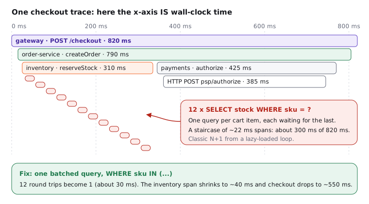
Read it the way you read a profile, top-down this time: the root gateway span is 820 ms. Under it, order-service makes two calls one after the other. payments is 425 ms, and almost all of it is the external payment provider, which you can't make faster but could maybe start in parallel with the inventory check. Then look at inventory: below it, twelve tiny SELECT spans, each starting when the previous one ends. That staircase is an N+1 query: one query per cart item instead of one query for the cart. It costs about 300 ms, and a batched WHERE sku IN (...) takes it to about 30.
Trace flame graphs are one of several views of the same spans, and each answers a different question:
- Span list: a table you can sort by duration or filter by error. Best for "which span is slowest?"
- Waterfall (Gantt): each span on its own row in time order. Staircases and serial calls jump out here.
- Service map: an aggregate graph of services and the calls between them across many traces, with rates, errors and latency on the edges. Best for "which dependency is hurting everyone?"
06Patterns to recognise on sight
After a few dozen flame graphs, the same shapes keep coming back. Learn these six and you'll diagnose most graphs before reading a single frame name.
Six recurring shapes: wide plateau, N+1 staircase, parent wider than children, deep narrow tower, repeated subtrees and errors bubbling up
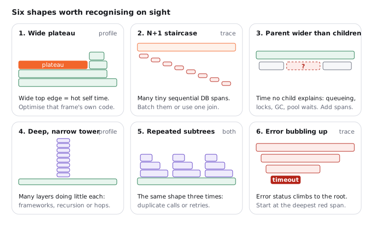
- Wide plateau. A frame with a broad, flat top is burning CPU in its own code. This is the best kind of finding: one function, one fix.
- N+1 staircase. Many short, identical sibling spans, each starting as the previous ends. The fix is batching, a join, or a prefetch, not a faster database.
- Parent wider than its children. Time that no child span accounts for: the request waited for a connection pool, a lock, a thread pool queue or a GC pause, or called something nobody instrumented. Add spans or look at a wall-clock profile of that service.
- Deep, narrow tower. Dozens of frames stacked up, each doing little. That's proxy, filter and interceptor layers, deep recursion, or a call chain hopping across many services. Each layer is cheap; the depth is the cost.
- Repeated identical subtrees. The same shape appears three times under one parent: the same data fetched repeatedly, a missing cache, or a client quietly retrying. Count the copies and ask why there's more than one.
- Errors bubbling up. In traces, a failed span marks its parents as failed too. Don't stop at the root; walk down to the deepest span with error status, because that's where it started (here, a timeout).
07Advanced: how people misread flame graphs
Many candidates read a CPU flame graph left to right, as if JsonWriter ran first and RequestLog ran last. That's frequently a mistake, because profile frames are sorted alphabetically to make merging work. Rename a class and it moves. Time order only exists in trace flame graphs and in special time-ordered profile views (async-profiler and JFR can produce those, but they're labelled as such).
Three more traps catch experienced engineers:
- Optimising a wide frame whose width belongs to its children.
OrderService.pricewas 70% wide with 2% self time. Width is inclusive; only the plateau is yours to speed up. Always ask "how much of this is self?" before you open the file. - Profiling a cold or debug JVM. For the first seconds or minutes, the JIT is still compiling, so you'll see interpreter frames and compiler threads that vanish under steady load. Warm up first (a few minutes of realistic traffic is a good default). Never profile with a debugger attached,
-Xint, or a dev-mode framework that disables caches: you'll optimise something production never runs. - Treating an "after" graph's proportions as absolute. As we saw, every frame grows when the total shrinks. Compare absolute numbers (CPU per request, sample counts, latency) or use a differential flame graph.
| Profiling flame graph | Trace flame graph | |
|---|---|---|
| Built from | thousands of sampled stacks, merged | one request's spans |
| x-axis | share of samples, alphabetical | wall-clock time |
| Width | inclusive samples (CPU, bytes, wait time) | span duration |
| Gaps | never | real waiting or uninstrumented work |
| Scope | one JVM, all requests | one request, many services |
| Best for | "which code is expensive?" | "where did this request's latency go?" |
08How to say it in the interview
When I ask this, I'm listening for three things. Do you know the x-axis of a profile is not time, and that width is inclusive so the plateau is what matters? Do you pick the right profile type for the symptom instead of always grabbing CPU? And do you have a calm, ordered process for the classic follow-up: "You see a CPU spike, walk me through it." At this point, you should ask your interviewer whether the spike is on every instance or one, and whether it lines up with a deploy.
In the interview
"First I confirm and scope it: which instances, since when, and does it line up with a deploy or a traffic change. Then I rule out the GC, because GC threads burning CPU look like a CPU spike: I check GC time and pause metrics and the GC log. If it's application code, I find the hot threads with top -H and match them to a jcmd Thread.print dump, then capture a 30-second CPU profile with async-profiler, or dump the continuous JFR recording. In the flame graph I ignore the left-to-right order, look for the widest plateaus, walk down to the first frame in our code, and use search to total it. If CPU looks normal but latency is bad, I switch to a wall-clock or lock profile. After the fix, I compare absolute CPU per request, or a differential flame graph, against the baseline."
Here's how this might look if you sketch it on the whiteboard:
On the whiteboard
Reading a flame graph
- profile: y = stack depth, width = % samples (inclusive), x = A-Z, NOT time
- plateau (top edge) = self time → optimise that
- CPU / wall / alloc / lock → pick by symptom; diff graph: red grew, blue shrank
- asprof -d 30 -e cpu -f cpu.html PID · jcmd PID JFR.start
- async-profiler + JFR: no safepoint bias
- trace: x = time, gaps real; staircase = N+1; parent > children = waiting
- CPU spike: scope → rule out GC → hot threads → profile → plateau → fix → compare
Interview questions for this topicComing soon